Visualizing Energy Infrastructure of the United States
This study was part of a larger effort to understand spatial patterns of energy infrastructure and the connection to other conditions, including population density, demographic data and climate.
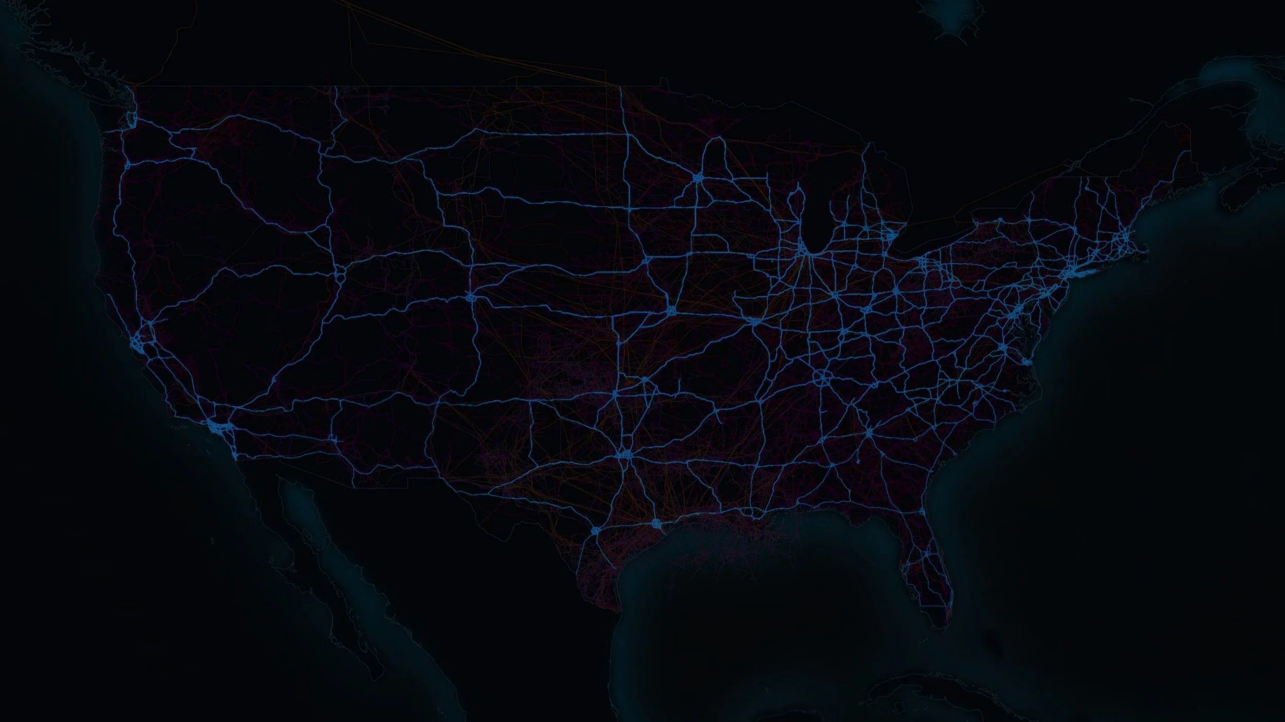
These maps were generated using data from NREL and pre-processed with Python to simplify geometries for faster rendering with Grasshopper & Rhino. The processed data was visualized as vector objects in Rhino using Grasshopper.
Energy Infrastructure in Layers
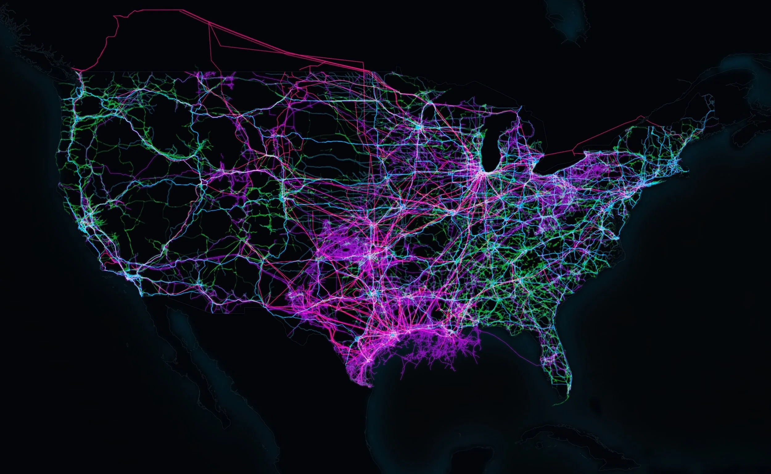
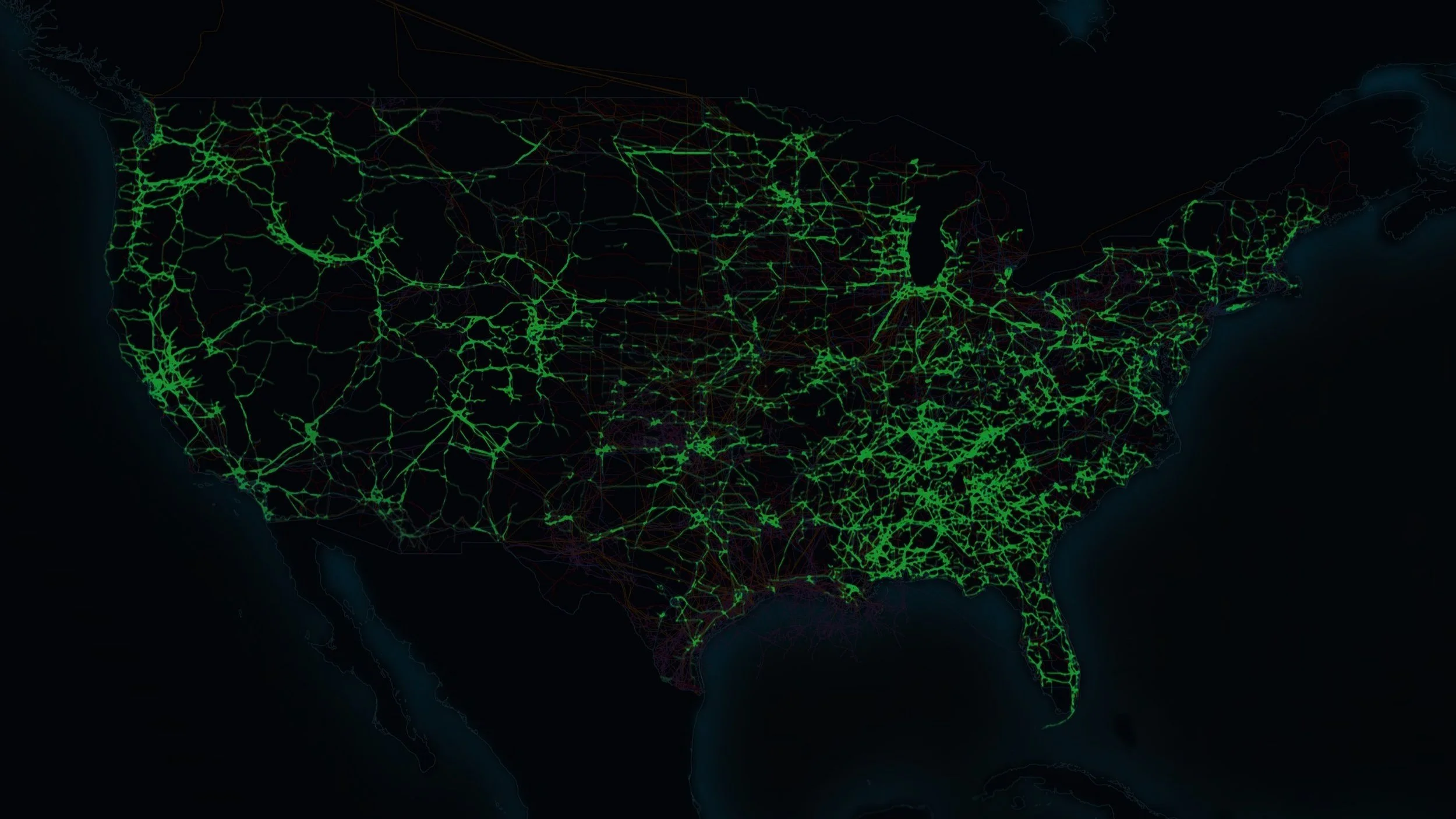
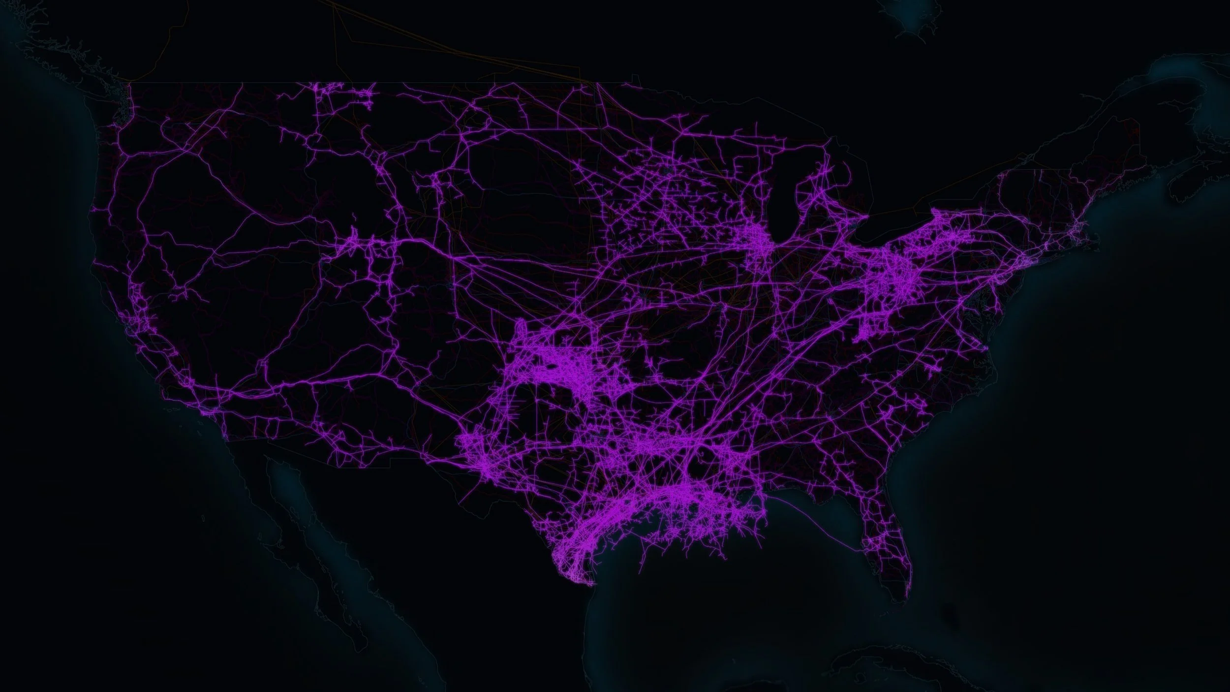
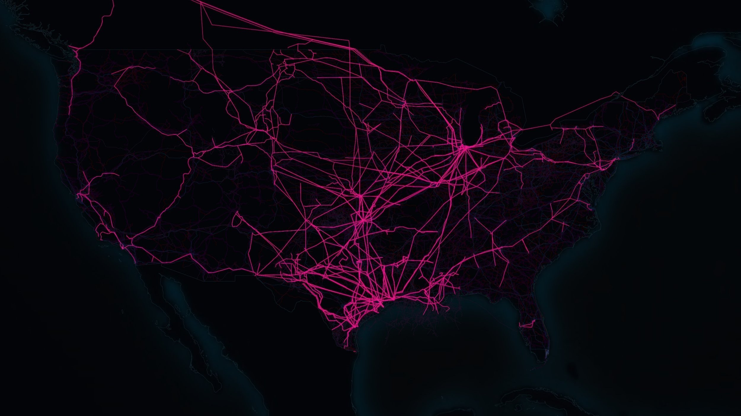
The map layers below visualize different layers of critical infrastructure in the U.S. including, high voltage transmission lines, petroleum pipelines, the national highway system, liquid natural gas pipelines and rail lines.
Composite Map - All Layers Combined
High Voltage Transmission Lines
Petrolium Pipelines
Liquid Natural Gas Pipelines
National Highway System (NHS)
Power Plants
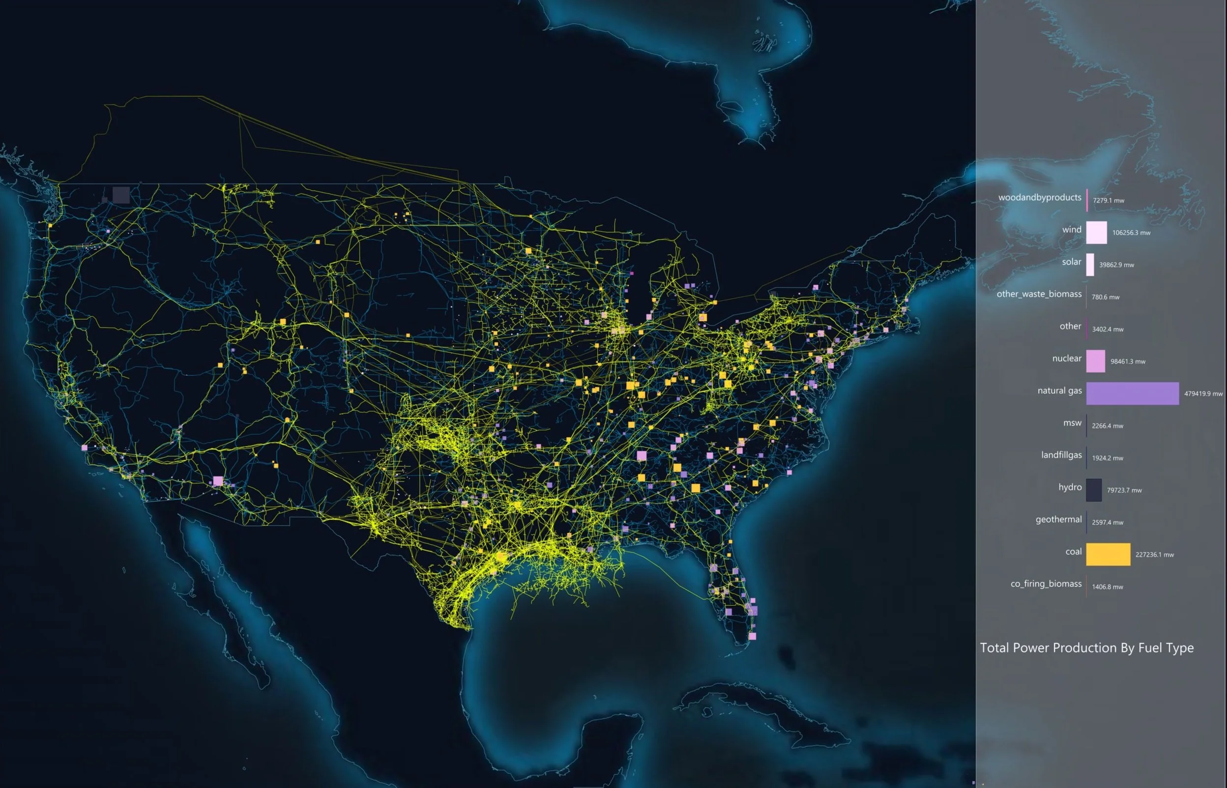
Another component of this project involved mapping the locations and generating capacity of power plants across the U.S. to analyze geographic trends in energy production. The two maps below were mockups made while I was worked out visual styling and various options for displaying information.
The top map shows power plants with the petroleum and LNG pipeline layers turned on. The horizontal bar chart on the right side of the map shows the combined generating capacity of power-plants by fuel type. The intent in overlaying power-plants with various infrastructure layers was to show the proximity of power-plants to infrastructure that supplies the power plant with fuel. The maps were intended to be zoomable and made such that the user could toggle layers on and off. The bottom map shows only the power-plant layer turned on.
Visualization with Grasshopper in Rhino
For many projects, I use Grasshopper as a tool for data visualization. Grasshopper is a parametric visual scripting tool and is widely used for generative design, automation, simulation and other applications in the architecture and design world. I find it to be a useful tool for prototyping data visualizations and data analysis/modeling projects. It provides a dynamic, flexible environment and allows me to work fluidly and quickly try out ideas without becoming overly focused on syntax and programming efficiency. Typically, if the project allows it, I will prototype new ideas with Grasshopper and then convert the script to a coded language like Python or JavaScript.
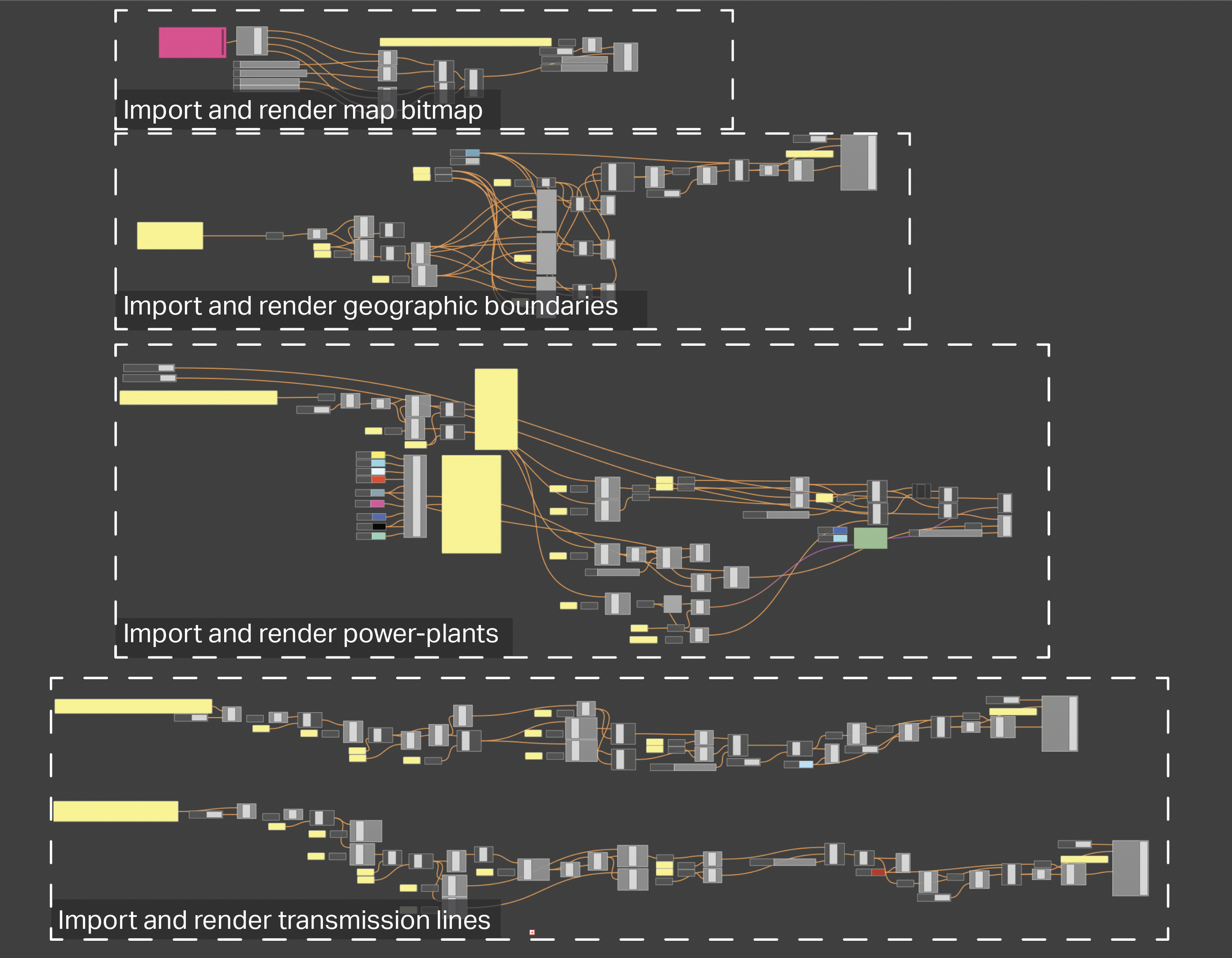
For this project, I used Grasshopper to develop the infrastructure maps shown above and to run geospatial analysis, which I will be making a project page and/or blog post on soon. The Grasshopper script is broken into various sections, each of which build a piece of the visualization.
As noted in the labeled screenshot, the main components of the script are:
Importing and rendering the bitmap layer
The bitmap layer is the map background that underlays the various infrastructure layers. That map was derived from a stitched satellite image of the earth and stylized with Photoshop to give make the glowing blue edges around continents.
Importing and rendering geographic boundaries
From a geojson file that contains the geographic boundaries of every country, this section of the script grabs boundaries of countries within view (The United States, Canada, Mexico, Etc.) and parses the coordinate paths and constructs a vector polyline in Rhino. This way we can have a crisp outline of each country.
Importing and rendering power-plants
Power-plant data is imported, parsed and grouped by fuel type. This allows us to color code power-plants by fuel type and run calculations to get the total energy generating capacity of power-plants by fuel type.
Importing and rendering infrastructure lines
Similar to the geographic boundary data, transmission lines, pipelines and other infrastructure line data came in the geojson and json format form NREL. The files were simplified with a custom Python script which smoothed the shape of transmission lines to reduce the number of vertexes prior to importing the data into the visualization model. Given that we are looking at these lines from a space-level altitude, the level of fidelity the original files provided was not necessary.
